|
中式文化延伸到餐饮界与设计界,就带来了中餐厅设计的出现。一家代表了中式文化的餐厅,只有注入了更多的中式文化元素,空间才会有更多的生命力,才会更好的吸引人们的目光。 The extension of Chinese culture to the restaurant and design world has brought about the emergence of Chinese restaurant design. A restaurant that represents Chinese culture will only be more alive and better able to attract people's attention if the space is infused with more Chinese cultural elements. ▼项目一瞥丨再設計空间事務所 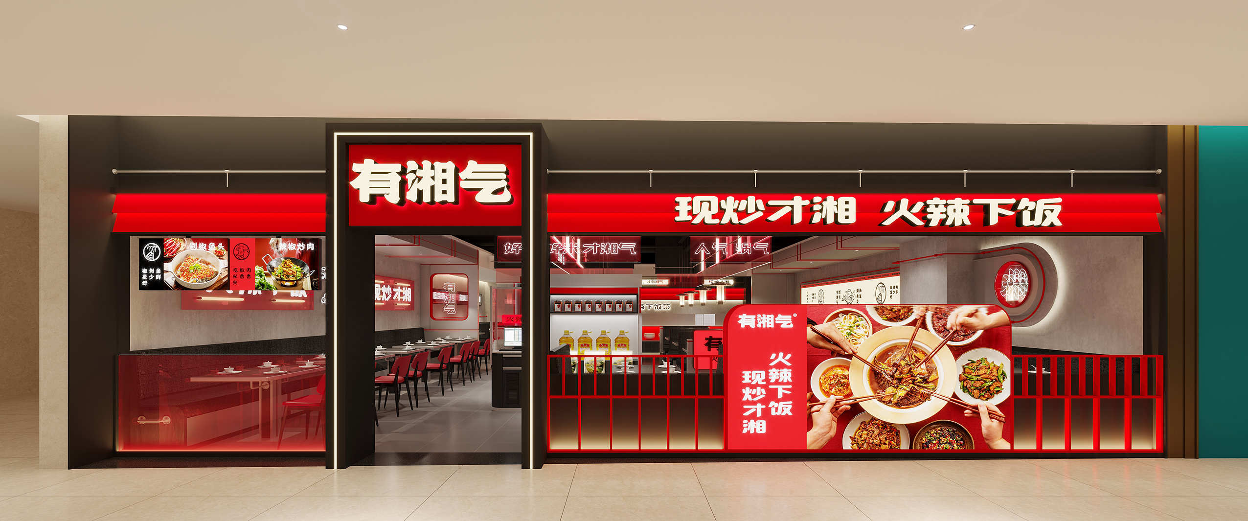
项目主题 | Project Background 以“湘”为核心 Xiang" as the core 该项目是一家湘菜馆,湘菜,又叫湖南菜,是中国历史悠久的汉族八大菜系之一,早在汉朝就已经形成菜系,以湘江流域、洞庭湖区和湘西山区,三种地方风味为主。 该项目主题是以“湘”为核心,取谐音的特色,湘菜的特色在于口味,在五觉中是视觉、味觉为主,通过“湘”来打造另外一个维度的感受。 The project is a Hunan restaurant, also known as Hunan cuisine, which is one of the eight major Chinese cuisines with a long history, having been formed as early as the Han Dynasty. The theme of this project is "Xiang" as the core, taking the harmonious characteristics, the characteristics of Hunan cuisine is the taste, in the five senses is the visual, taste is the main, through "Xiang" to create another dimension of feeling. ▼品牌VI丨再設計空间事務所 
品牌空间 | Brand Space 红色萦绕在空间中,调动美味联想 The red colour lingers in the space, mobilizing delicious associations 色调上采用了黑、红、灰作为空间视觉基调,结合品牌VI定制广告视觉内容,提升空间观感丰富度并达到品牌商业推广的目的。空间选用“辣红”为场景记忆符号,在空间中反复出现,加强用餐记忆点。高明度的红色萦绕在空间中,调动美味联想。 LOGO设计上放弃了原来不规则的手绘字体,中文“有湘气”设计结合了隶书和榜书的书法笔触,字形结构笔画都以“榜书”为基本结构,笔画中增加中国毛笔气韵,品牌字体厚重、沉稳,整体识别度更加清晰明确。 The colour palette is black, red and grey as the visual tone of the space, combined with the brand VI customised advertising visual content to enhance the richness of the space and achieve the purpose of brand business promotion. The space uses "hot red" as the scene memory symbol, which appears repeatedly in the space to strengthen the dining memory. The high brightness of the red colour lingers in the space, mobilising delicious associations. The design of the LOGO has abandoned the original irregular hand-painted font, and the Chinese 'You Xiang Qi' design combines the calligraphic strokes of the official script and the Pungshu script, The branding is heavy and stable, and the overall identity is clearer and more unambiguous. ▼效果图展示丨再設計空间事務所 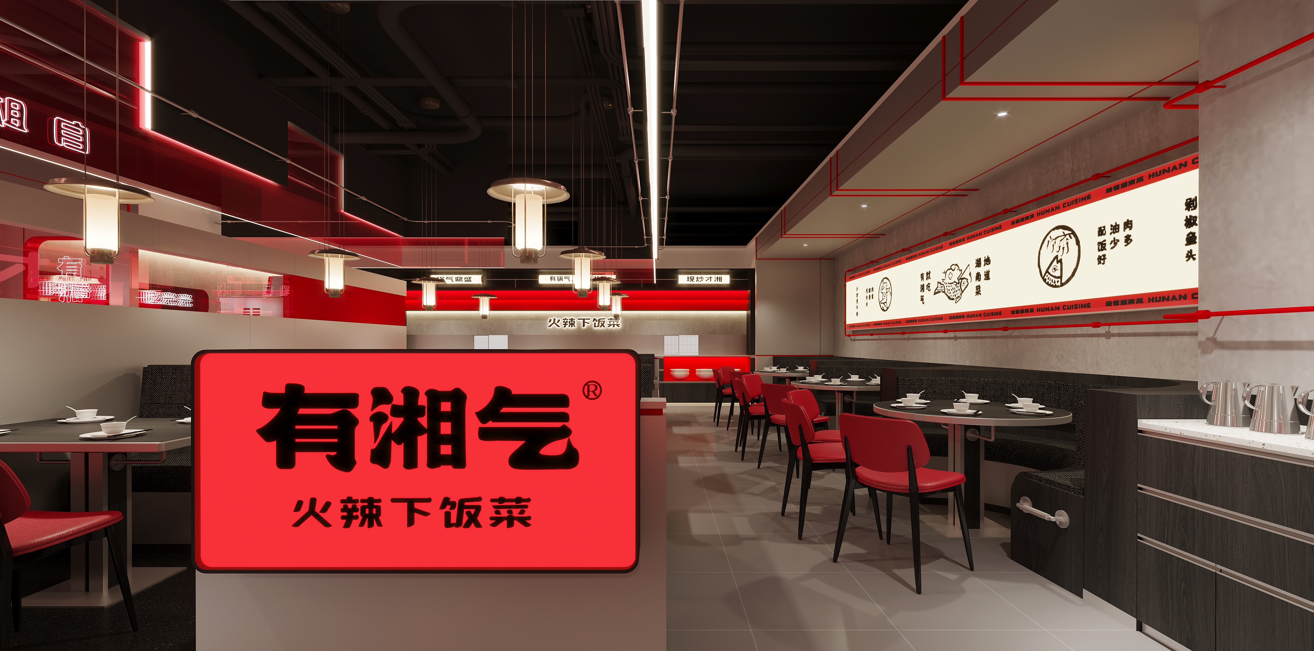
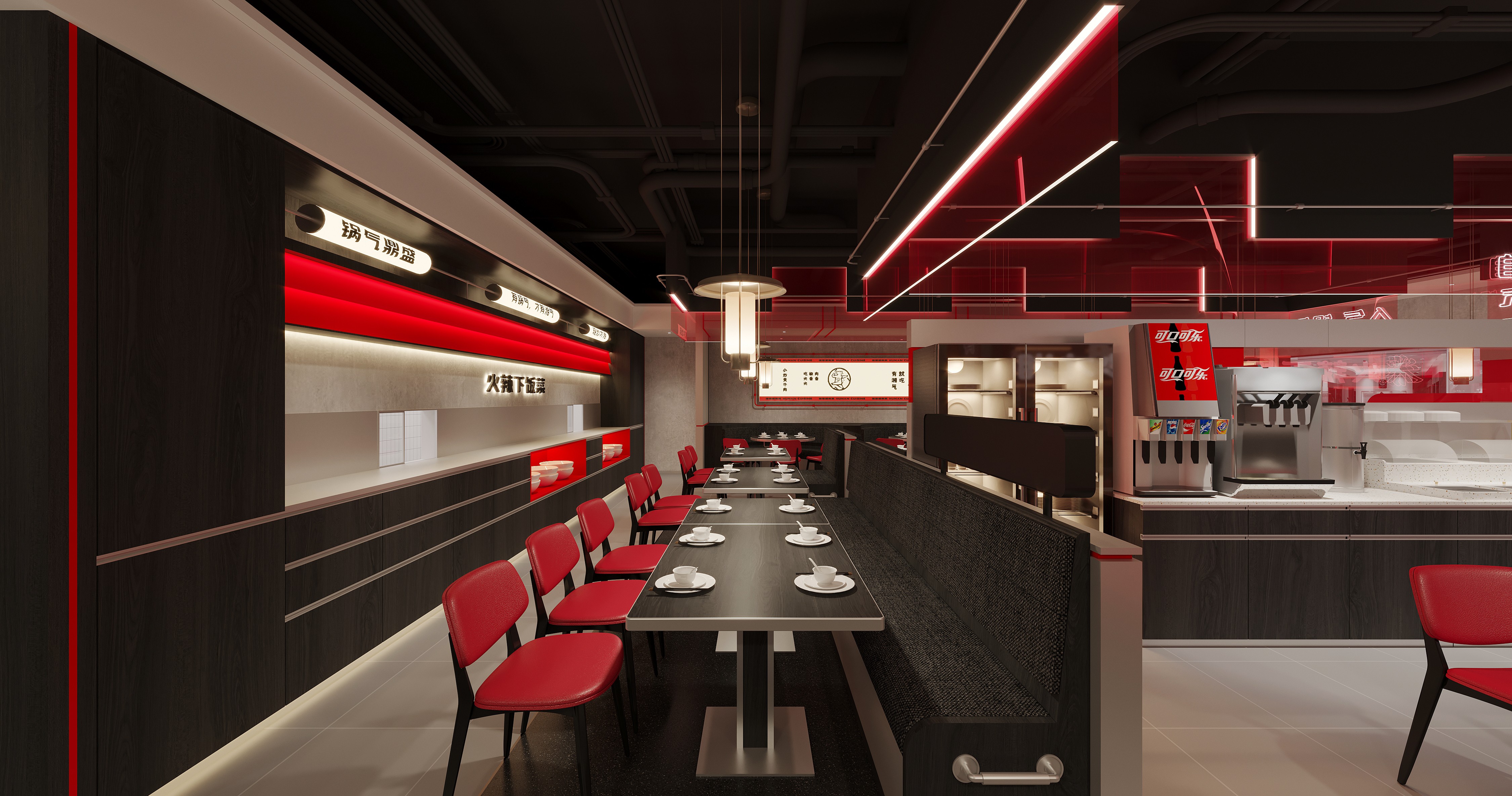
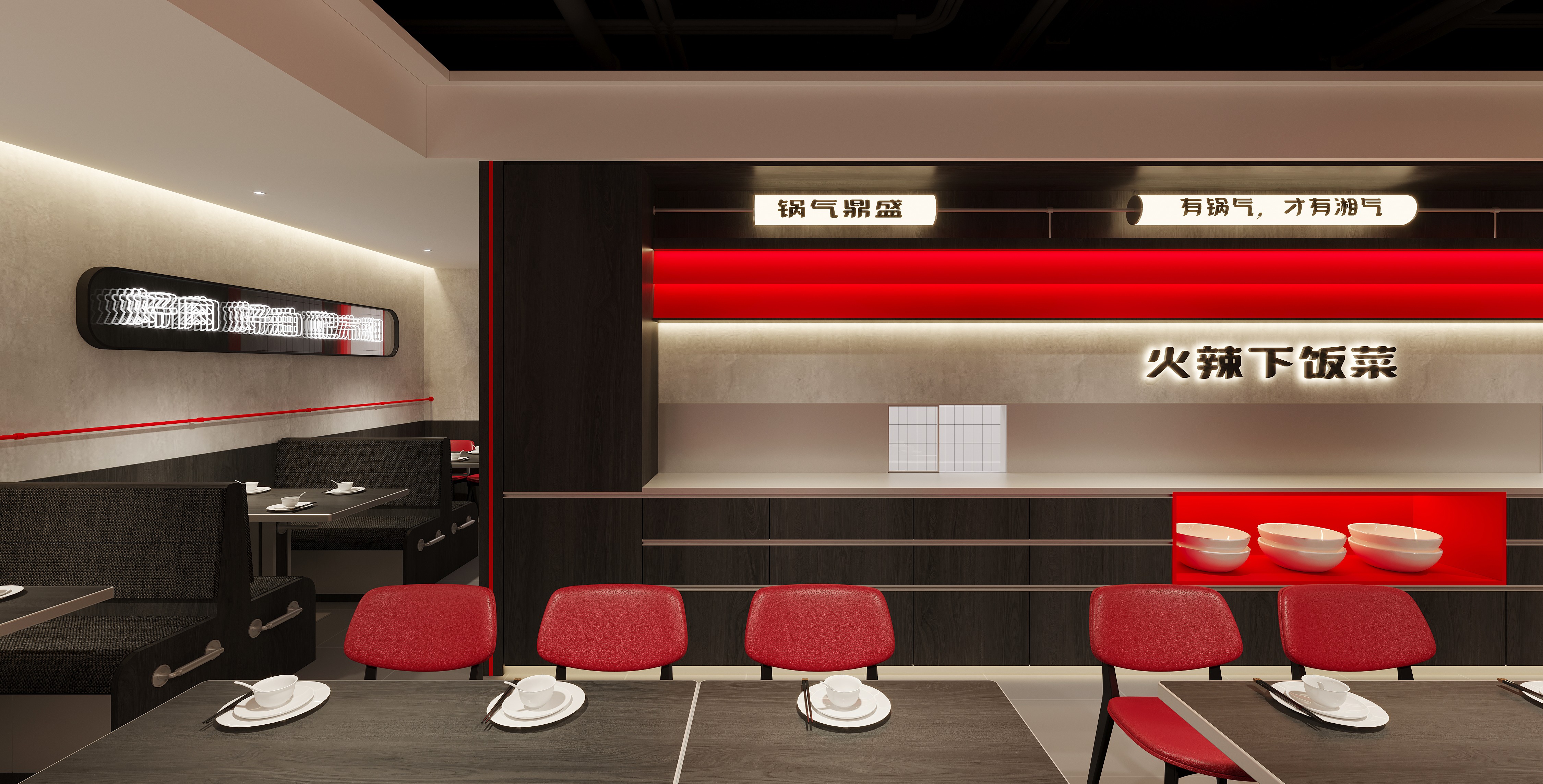
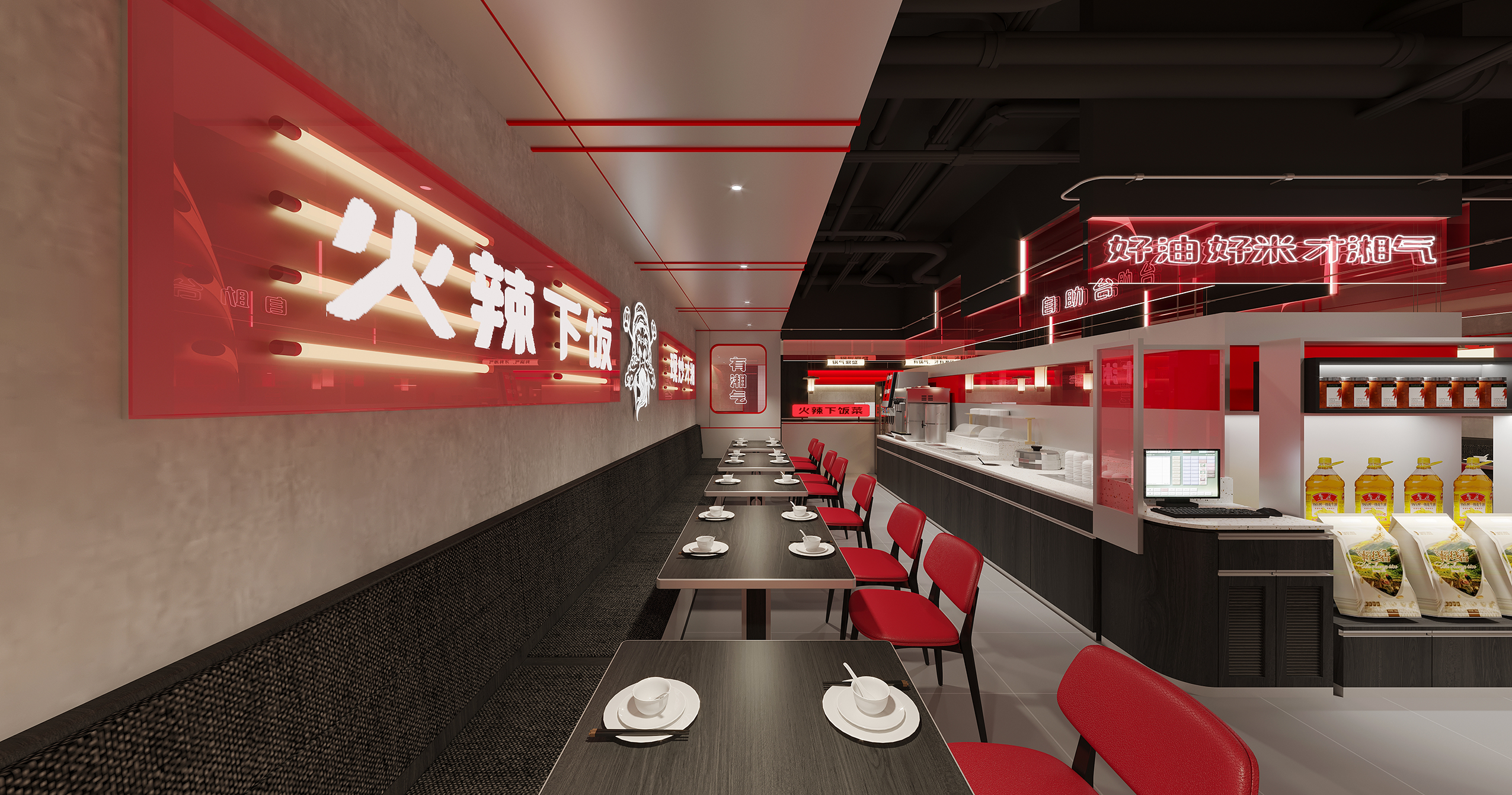
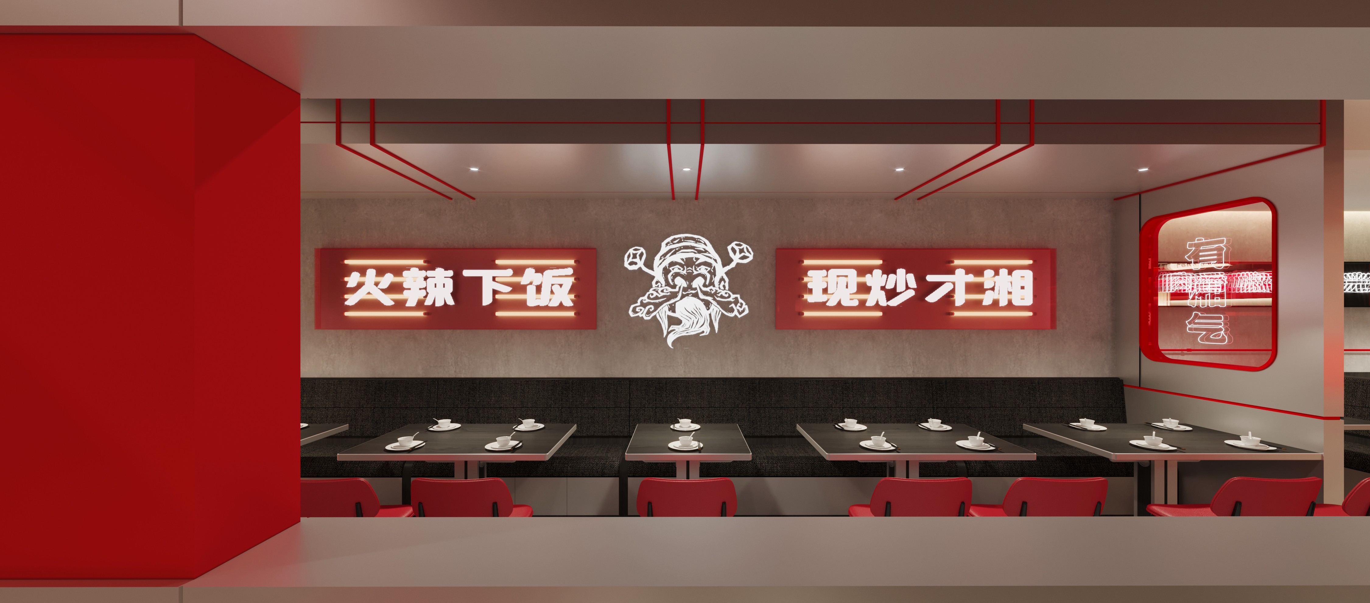
经典红塑造品牌主张的湘菜馆,可以说是湘菜在现代社会的一种新的表达和演绎,它们不仅展现了湘菜的美味和魅力,也展现了湘菜的创新和包容。它们是湘菜精致化、品牌化、产业化的一种尝试和探索,也是湘菜文化在新时代的一种传承和发展。 The classic red shaped brand proposition of Hunan cuisine restaurants can be said to be a new expression and interpretation of Hunan cuisine in modern society, they not only show the deliciousness and charm of Hunan cuisine, but also the innovation and tolerance of Hunan cuisine. They are an attempt and exploration of the refinement, branding and industrialisation of Hunan cuisine, as well as an inheritance and development of Hunan culture in a new era. ---------------------------------------------------------------------------------------------------------------------------------------- 项目名称丨有湘气 项目地点丨福建福州 项目面积丨205㎡ 项目类型丨餐饮空间 设计单位丨再設計空间事務所 
|
精华推荐
换一换

 收藏
收藏  说两句
说两句 





发表评论0